 Rias.be

Color Swatches
Color Swatches fieldtype for Statamic >= v6.
For the Statamic 3 & 4 version, check out the v2 branch.
For the Statamic 2 version, check out the v1 branch.
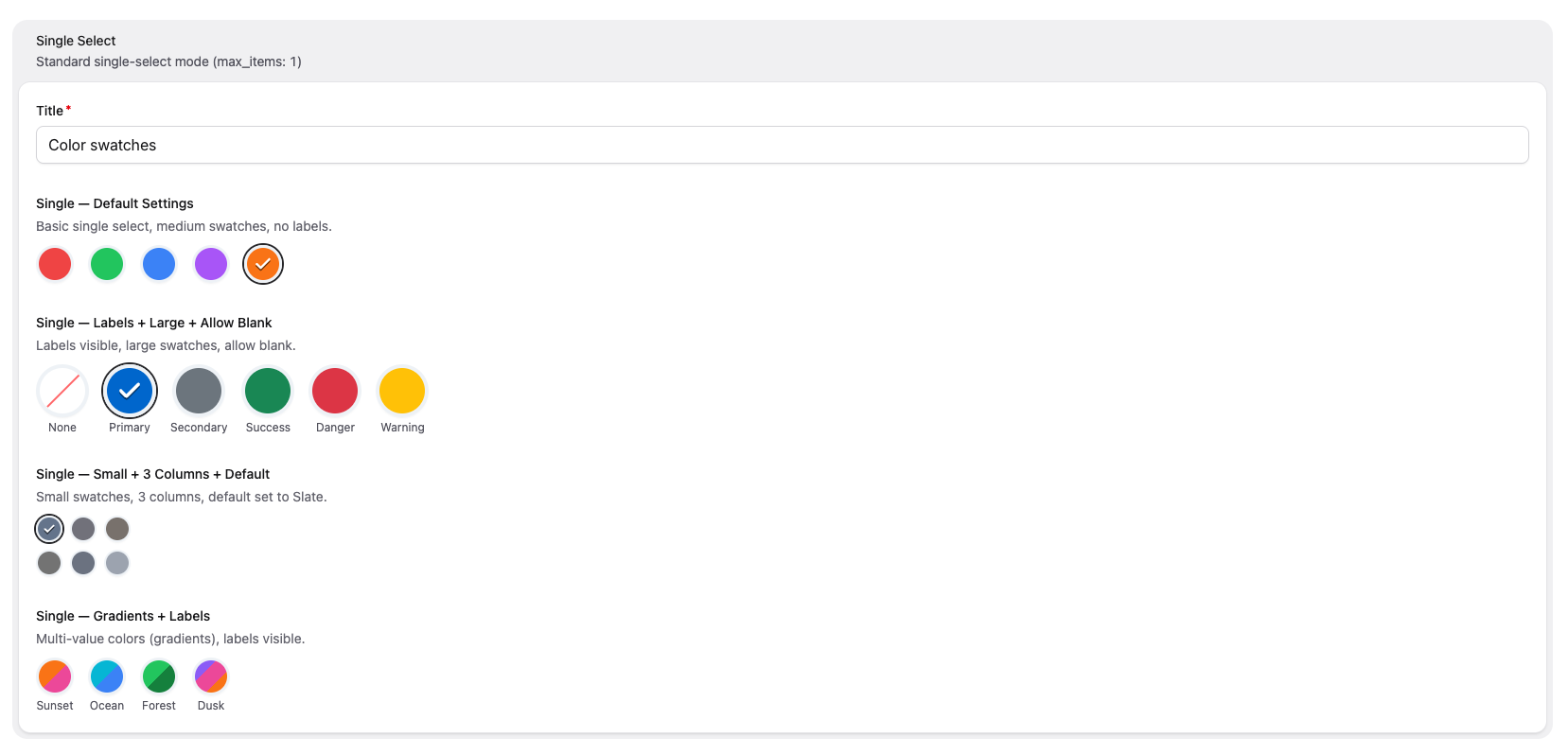
Instead of providing a full color picker, Color Swatches lets you define a fixed palette of colors for content editors to choose from — as clickable swatch buttons in the Control Panel.

License
Color Swatches requires a license to be used while on a production site. You can purchase one at https://statamic.com/marketplace/addons/color-swatches.
You may use Color Swatches without a license while Statamic is in Trial mode.
Installation
Require it using Composer:
composer require rias/statamic-color-swatchesConfiguration Options
| Option | Type | Default | Description |
|---|---|---|---|
colors |
grid | — | Define the available colors. Each color has a label and one or more values (CSS color strings). |
default |
text | — | The label of the color that should be selected by default. |
allow_blank |
toggle | false |
Show a "None" option allowing the user to deselect. |
max_items |
integer | 1 |
Maximum selectable swatches. Set to 1 for single-select, any other value for multi-select (0 = unlimited). |
min_items |
integer | 0 |
Minimum number of swatches that must be selected (multi-select only). |
show_labels |
toggle | false |
Display the color label below each swatch. |
swatch_size |
button group | medium |
Size of each swatch: small, medium, or large. |
columns |
button group | auto |
Grid columns for the swatch layout: auto (flex wrap), or 2–6 fixed columns. |
Usage
Blueprint Configuration
Add the fieldtype to your blueprint. Each color needs a label and a value array of CSS color strings:
sections: main: display: Main fields: - handle: color field: type: color_swatches display: Color colors: - label: Red value: - "#F56565" - label: Orange value: - "#ED8936" - label: Green value: - "#48BB78" default: Red allow_blank: true show_labels: true swatch_size: largeMulti-Value Colors (Gradients)
A color can have multiple values — the swatch will render as a linear gradient:
colors: - label: Sunset value: - "#F56565" - "#ED8936" - label: Ocean value: - "#4299E1" - "#48BB78"Multi-Select Mode
Set max_items to any value other than 1 to enable multi-select. Use min_items to require a minimum number of selections:
- handle: brand_colors field: type: color_swatches display: Brand Colors max_items: 3 min_items: 1 colors: - label: Primary value: - "#1a202c" - label: Secondary value: - "#2d3748" - label: Accent value: - "#ed8936" - label: Highlight value: - "#ecc94b"Set max_items: 0 for unlimited selections.
Templating
Single Select
The stored value is an object with label and value:
{{ color.label }}{{ color.value }} {{# For multi-value colors (gradients): #}}{{ color.value }} {{ value }}{{ /color.value }}Multi-Select
The stored value is an array of objects:
{{ brand_colors }} {{ label }} — {{ value }}{{ /brand_colors }}GraphQL
The fieldtype exposes a ColorSwatchType with:
label—Stringvalue—[String](always an array)
In multi-select mode, the field returns [ColorSwatchType].
Accessibility
- Swatches use proper ARIA roles (
radiogroup/radiofor single-select,group/checkboxfor multi-select) - Each swatch has a descriptive
aria-labelwith the color name and selection state - Keyboard focus is indicated with a visible focus ring
- Selected swatches display a checkmark overlay
- Disabled swatches (when max is reached) are visually dimmed and marked as
disabled
Brought to you by Rias.