 Philipp Daun
Icon-only button fieldtypes for compact toggles and switches.
Installation
Install the addon via Composer:
composer require daun/statamic-icon-button-fieldtypesFieldtypes
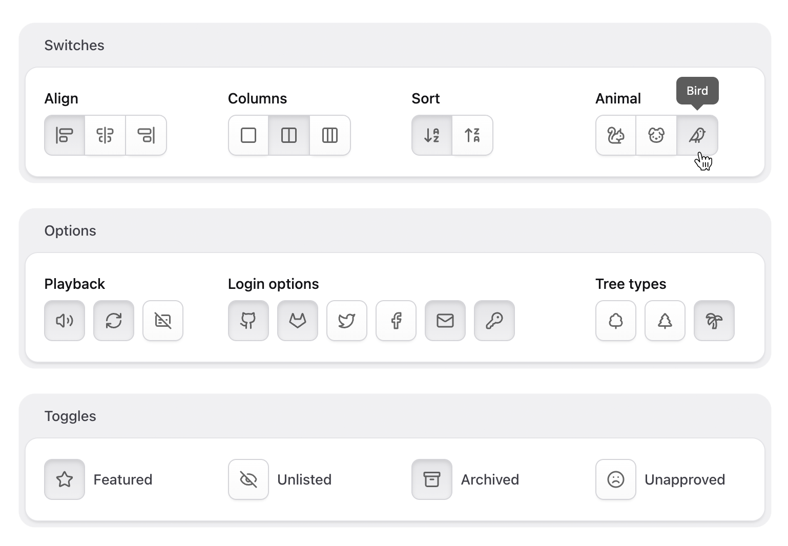
The addon ships with three fieldtypes, each extending a native Statamic fieldtype:
- Single-choice Icon Group extends the native Button Group
- Multi-Choice Icon Toggles extends the Checkboxes fieldtype
- Boolean Icon Toggle extends the Toggle fieldtype
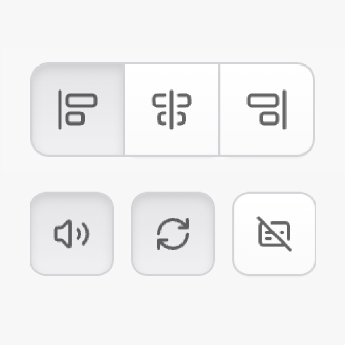
Icon Group
The Icon Group fieldtype extends the native Button Group fieldtype and allows selecting a single option from a predefined set of options.
align: display: Align- type: button_group+ type: icon_group options: - value: Left key: left+ icon: align-start-vertical - value: Right key: right+ icon: align-end-verticalIcon Toggles
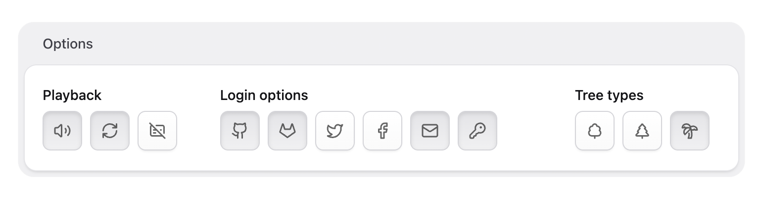
The Icon Toggles fieldtype extends the native Checkboxes fieldtype and allows selecting one or more options from a predefined set of options.
playback: display: Playback options- type: checkboxes+ type: icon_toggles options: - value: sound key: sound+ icon: volume - value: Loop key: loop+ icon: repeat - value: Captions key: captions+ icon: captionsIcon Toggle
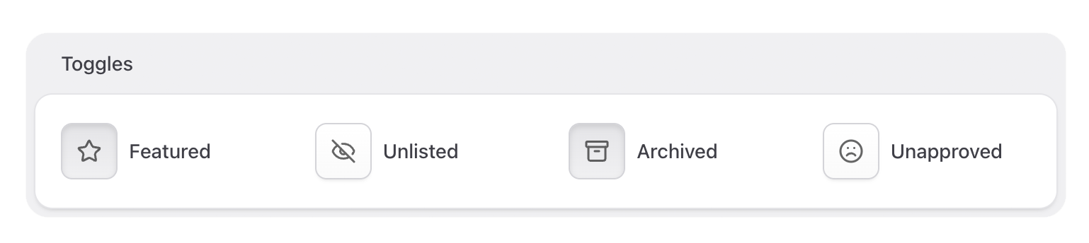
The Icon Toggle fieldtype extends the native Toggle fieldtype and allows switching a single value on or off.
featured: display: Featured- type: toggle+ type: icon_toggle+ button_icon: starNote that the option here is called button_icon because icon key is a reserved key by Statamic.
Custom Icon Sets
Icons are pulled from the built-in icon set. To use icons from a different set, register a custom icon set and change the set option of each field to the desired set.
Example: Lucide
Install and use the Lucide icon set, used in the examples above.
npm install lucide-staticRegister the icon set in your service provider.
use Statamic\Facades\Icon; class AppServiceProvider extends ServiceProvider { public function register() { Icon::register('lucide', base_path('node_modules/lucide-static/icons')); }}Switch the field to use the custom icon set.
featured: display: Featured type: icon_toggle button_icon: star+ set: lucideExample: Local SVGs
You can also use local SVG icons in your resources folder.
Icon::register('payments', resource_path('icons/payments'));