The Newsroom → Article → Jun 30th, 2026
Try some chips, why don't you?
Try some chips, why don't you?
Meet chips: a friendlier, alternative way to present radio buttons and checkboxes.
Statamic now supports "Chips" as an appearance option for Radio and Checkbox fields, as of v6.22.
For the longest time, radio buttons and checkboxes have been the default way to communicate choice in user interfaces.
After decades of conditioning, people instinctively understand that little circles mean “pick one” and little squares mean “pick one or more”. These patterns are deeply embedded in how we use the web.
Just like a pair of Crocs, they're not exciting—but functional and somehow everywhere.
Why mess with this? Well, every once in a while, a new UI pattern emerges that puts a modern twist on established affordances. The most obvious example I can think of is the "switch". You know the one—the toggle control that’s absolutely everywhere on your phone and has slowly spread across every app, dashboard, and admin panel on the planet. Including ours.
Under the hood, a switch is basically just a checkbox. It’s still a binary choice: on or off, yes or no, would you like pineapple on your pizza?
Radio buttons and checkboxes are still lurking underneath every shiny new affordance. They do the same thing, they just look and work better in many circumstances.
Why reinvent the wheel?
Bear with me while I bang on about the switch a little longer. If a switch is just a checkbox, why bother?
The switch has a few advantages over a checkbox control.
First, it's bigger and easier to see. But more importantly, switches are easier to hit. On a touchscreen in particular, it can be a little difficult to tap those little checkboxes. Think of agreeing to terms and conditions (that no one reads) on mobile — I always feel like I might accidentally hit something else that surrounds that bitty speckled checkbox.
Checkboxes were designed to be poked by a precise little arrow controlled by hi dpi mouse that uses LASERS for extreme accuracy. Switches, on the other hand, are chunky chonk cats that are easy tap with our fat, shaky sausage fingers. There, I said it.
What are chips then?
Chips are small, pill-shaped controls that represent a choice.
You’ve definitely seen them before, even if you didn’t know what they were called. Sometimes they allow multiple selections, behaving like checkboxes. Other times, they allow a single selection, behaving like radio buttons.
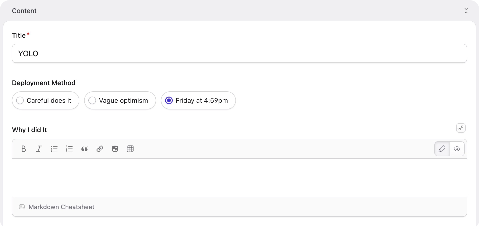
Here’s an example of radio chips in the v6 control panel. Notice that the visual affordance of a selected radio button is preserved: the active option is represented by a filled circular indicator.:
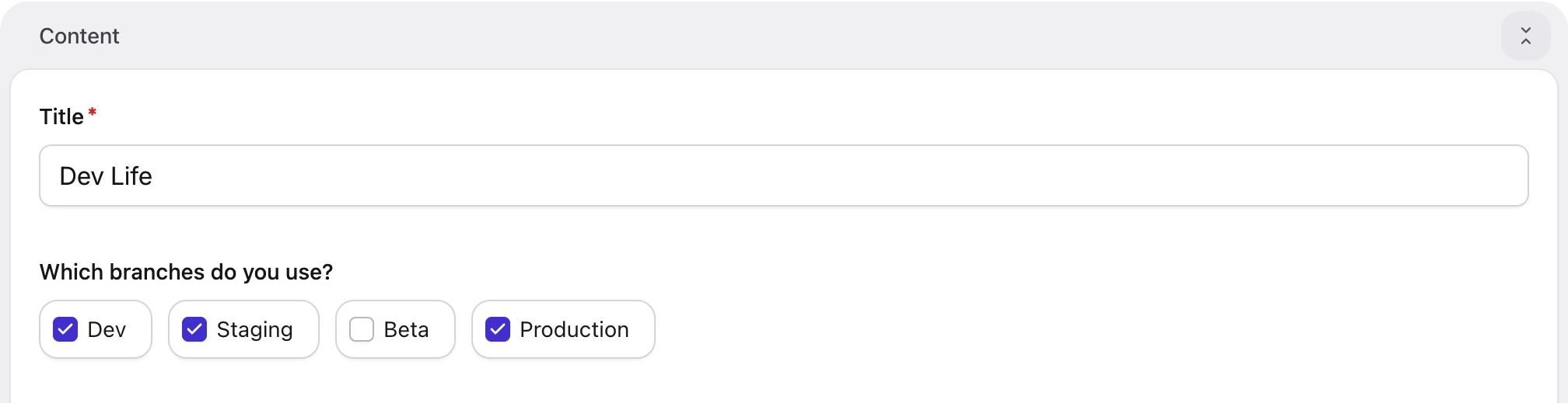
And here’s an example of checkbox chips. In this case, the visual affordance of a checkbox is retained, with a rounded-square indicator that can be independently toggled on or off:
Advantages of chips
Like the switch improved a single-choice checkbox, I think chips have several advantages over their native brethren:
- They're also chunky chonk cats. Due to the padding/defined border around chips, it's much easier to hit them with your thumb or click them with a mouse without having to guess where the end of their invisible space is.
- Traditional radio groups and checkbox lists can get pretty tall. Chips are only ever "inline", which means they take up horizontal space. This can be useful for breaking up a layout or keeping publish forms concise.
- They look different. And not just in a "ooo shiny" way (well… maybe a little). But if you're building a blueprint for your client to use, you want them to have fun and grasp things easily, right? That's why you chose Statamic, after all. If you mix up checkboxes, radios, and chip variants, things become just a little bit more interesting.
So, when should you use them?
There’s no hard rule, but chips tend to work best when:
- You have several options to choose from
- The labels are relatively short
- You want selections to feel fast and lightweight
If your users are choosing categories, tags, preferences, or similar bite-sized options, chips often feel more natural than a towering list of circles and boxes.
How can you use them?
Firstly, make sure you're on at least version 6.22.
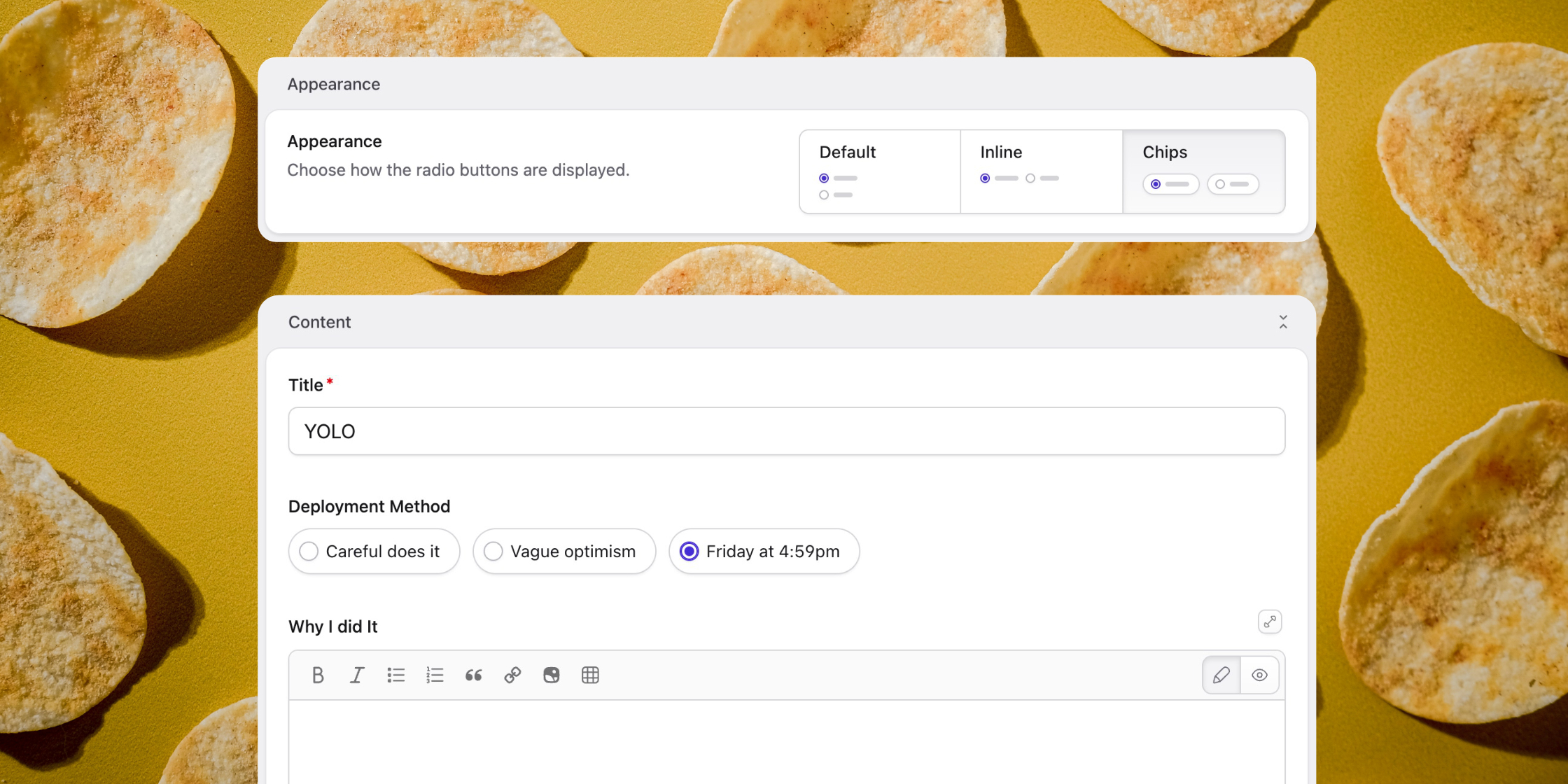
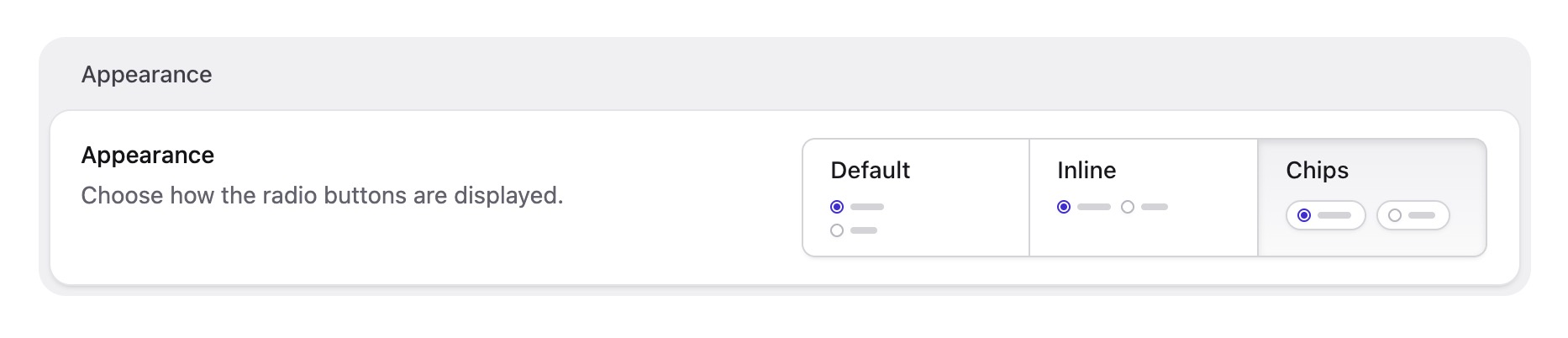
You'll find chips in the blueprint under radio or checkbox field type options—the same place that we already have the "Appearance" option:
Radios
Checkboxes
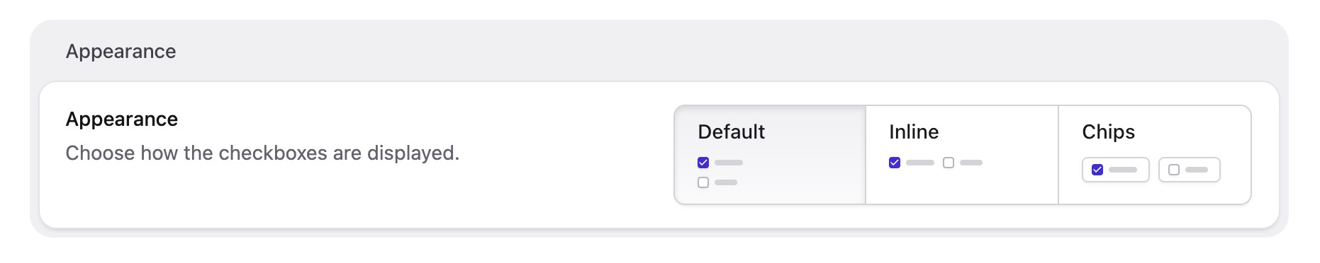
Select the chip variant and your options will be displayed as lovely little pills instead of traditional radio buttons or checkboxes.
Why oh why are they called chips?
If you’re British, the word “chips” probably makes you think of a shop you go to after a few beers. If you’re American, you might be imagining something that comes in a crinkly bag. Yes, English is confusing.
But in this case, think more along the lines of a poker chip: a small, self-contained token that represents a choice, category, or piece of information. That’s the metaphor most designers have in mind.
The term was popularised by Google’s Material Design system, which officially refers to these components as “chips.” Google’s guidelines describe them as compact elements that represent inputs, attributes, actions, or selections. Once Material Design became widely adopted, the name spread throughout the industry.
That said, they're also called "Badges", "Pills", "Tokens" or "Tags" elsewhere, if that helps you get over it.
None of these terms is perfectly interchangeable, and every design system has its own opinions about the subtle differences. But this is our take on them, and we hope you like 'em.